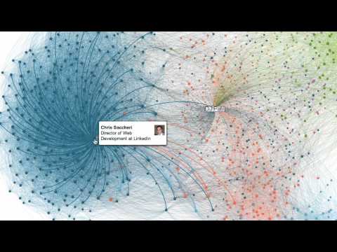
I have just read a post by PR blogger Sherrilynne Starkie in which she highlights a new tool which has been launched called InMaps.
Basically the new service allows you to visualise your connections on Linked-in, it accesses the api and creates a pretty graphic grouping your connections by different colours. Then you the user have to go through these colours and decide what they show and how useful they are. I think the graphic is really clever and pretty but I am not sure how much added value I would actually get from sifting through the colours and tagging up each one in the legend. I have enclosed the YouTube video which explains what its all about.